Orrills Hills
Brand Identity
Graphic Design
Project Overview
Orrills Hill Tick & Mosquito came to us looking for a refreshed identity that captured both the professionalism of their services and the natural environments they protect. Their previous branding didn’t fully reflect their expertise or the trust homeowners place in them to keep their properties safe. They needed a visual identity that felt clean, reliable, and rooted in the outdoors.
Every color in our palette was chosen to reflect the natural environments Orrills Hill protects. The deep blues convey strength, trust, and reliability, while the muted greens evoke balance, growth, and a strong connection to the outdoors.
Deep Harbor Blue
#233d4c
Misty Juniper
#496965
Sage Surf
#587a71
Olive Slate
#5d6a50
Dusty Steel Blue
#809aaa
A Brand Reimagined: Built on
Trust and Protection
Orrills Hill wanted a brand identity that matched the quality, reliability, and care behind their tick and mosquito control services. Their previous look didn’t fully reflect their connection to nature or the trust homeowners place in them to keep their properties safe. We partnered with their team to create a refreshed identity rooted in clarity, environmental awareness, and professionalism.
The result is a polished, modern brand system that strengthens credibility, highlights their expertise, and creates a consistent visual presence aligned with the dependable service they provide.
Design That Builds Trust From the Ground Up
Orrills Hill provides reliable, professional pest control services, and their brand needed to communicate that same sense of security and expertise. We developed a visual identity that feels clean, strong, and approachable, reflecting both their deep knowledge of the industry and the peace of mind they bring to homeowners. From the thoughtful color palette to the modern logo system, every detail was crafted to reinforce trust and highlight their commitment to protecting the spaces families care about most.
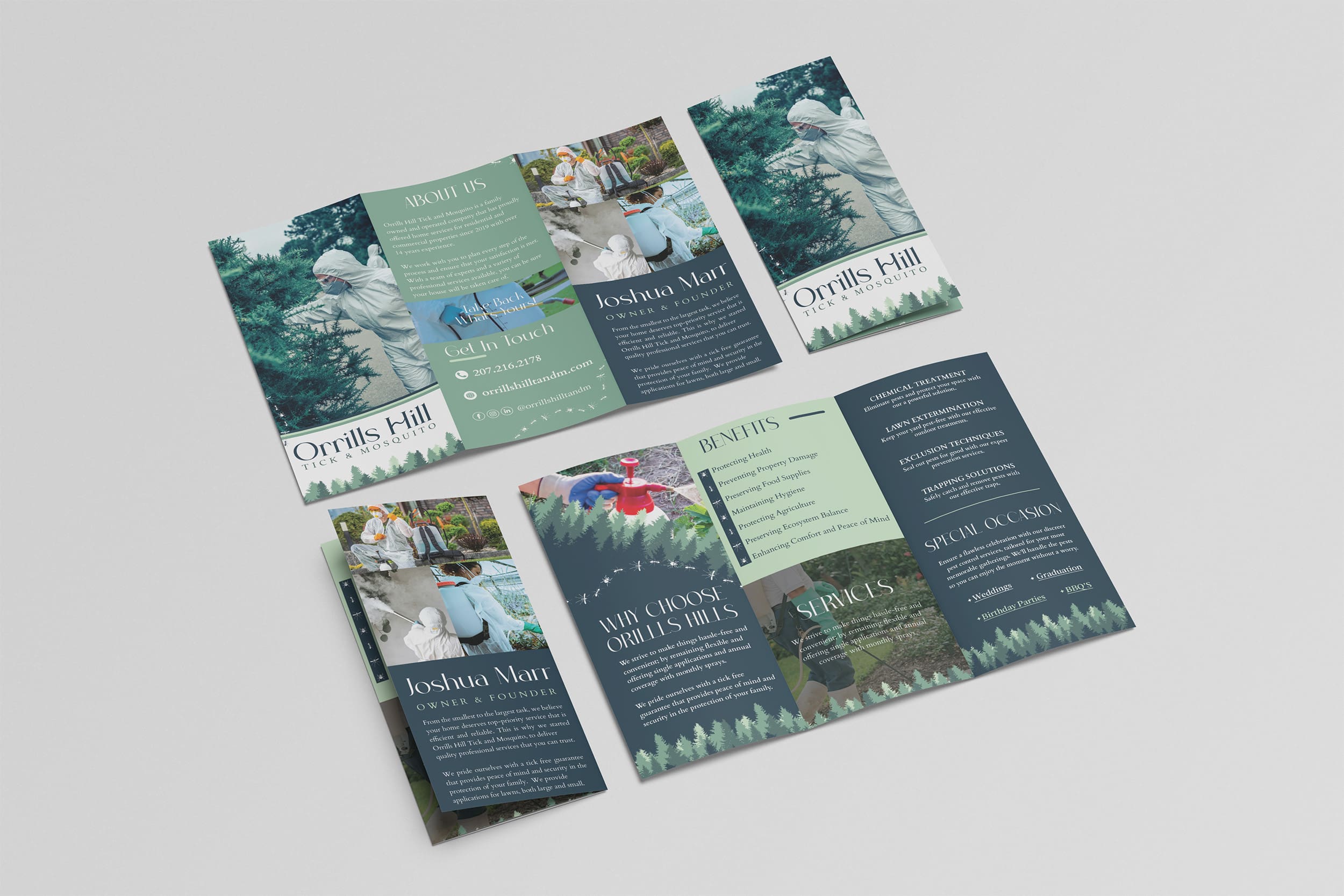
Identity Designed for Reliability and Recognition
- Business cards designed to extend the brand identity beyond digital
- Clean typography and structured layouts that communicate professionalism
- Nature-inspired color palette applied boldly for strong recognition
- Visuals that convey protection, trust, and environmental awareness
- Print-ready assets that maintain clarity and quality across every format
- Cohesive visual system that reinforces Orrills Hill’s identity at every touchpoint
Related Work
Coastal Palms
Coastal Palms

Three Peaks Pediatrics
Three Peaks Pediatrics
Three Way Logistics