BLK OUT
Brand Identity
Website Development
BLKOUT came to us with a sharp perspective and a clear priority build a logistics brand rooted in reliability, hard work, and real results. With a focus on intermodal, LTL, and expedited freight services, they needed an identity and digital presence that cut through the noise and reflected their commitment to honest communication, operational efficiency, and a job well done.
We partnered with BLKOUT to develop a bold, grounded brand from a stripped-down, modern visual system to a clean, direct website built to resonate with logistics professionals and decision-makers. The result is a brand experience that trades fluff for function and positions BLKOUT as a dependable partner in an industry built on trust and execution.
Color Pallete
Every element of BLKOUT’s brand was built to communicate clarity and confidence from the stark black-and-white palette that reinforces strength and honesty, to the bold typography and stripped-back layouts that reflect their direct, no-frills approach to logistics.
Rich Black
#0E0F11
Carbon Gray
#18191D
Carrot Orange
#F18721
Cultured
#F2F3F5
Pure White
#FFFFFF
Logistics, Unfiltered: A Modern Brand
for BLKOUT
BLKOUT came to us with a clear mission and a bold voice but without a brand presence that matched their straight-talking, results-driven approach to logistics. We partnered with them to build an identity that cuts through the fluff, developing a sharp, minimal logo, a utilitarian visual system, and a direct, functional website tailored to the realities of freight, intermodal, and expedited delivery.
From brand development to digital execution, our work gave BLKOUT a strong, confident presence that reflects who they are: a reliable logistics partner that values performance over pretense, and action over appearances.
Every Move, Filmed with Precision


Website Designed for Clarity and Grit
BLKOUT operates in a space where performance matters more than polish, so their website had to deliver with the same focus and efficiency they bring to every shipment. We built a digital experience that’s bold, clean, and unapologetically direct. With stripped-back design, intuitive navigation, and zero distractions, the site makes it easy for customers to understand their services and take action. The result is a no-fluff, high-impact website that reinforces BLKOUT’s position as a straight-talking, get-it-done logistics partner.
A Bold Look for a Straight-Talking Brand
We expanded BLKOUT’s visual identity into a suite of custom graphics designed to support their bold, no-fluff positioning. From clean, punchy layouts to strong typographic treatments, each graphic reinforces its core values of clarity, grit, and execution. Whether for brochures, tradeshow designs, or business cards, every asset was built to look sharp, work hard, and get straight to the point, just like the brand itself.
“Amazing people, amazing services! We've been with Don Creative since it was formed, and they continue to push the envelope on design, implementation, and customer service. Easy choice!”
Garrett SweigertBLKOUT
Related Work
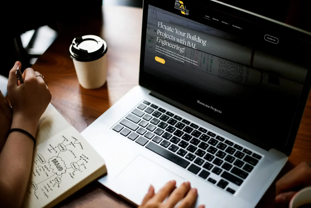
BAL Engineering
BAL Engineering
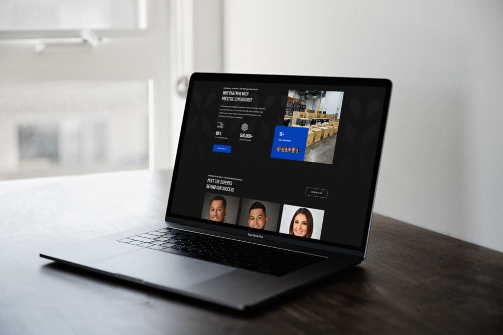
Prestige Expeditors
Prestige Expeditors

Midwest Express
![Every wallpaper pattern is a moodboard waiting to happen.
[Branding, Marketing, Content Creation, Social Media Strategy, SEO, Creative Agency, Small Business Growth, Web Design, Digital Marketing, Creative Projects, Design Inspiration, Brand Development, Client Experience, Business Growth]
#DesignInspiration #CreativeProjects #BusinessBranding #SocialStrategy](https://doncreativegroup.com/wp-content/plugins/instagram-feed-pro/img/placeholder.png)