TABCon-Nex
Brand Identity
Graphic Design
TABCon-Nex came to us with a smart, scalable solution for mobile workforce management but needed a brand and digital presence that clearly conveyed its functionality, value, and ease of use. With features like time tracking, geofencing, and HR compliance built in, the app is designed to simplify operations for on-the-go teams and small businesses.
We partnered with TABCon-Nex to sharpen their identity developing a streamlined visual system, user-friendly interface guidance, and a clean, modern website that communicates benefits at a glance. The result is a confident, approachable presence that positions TABCon-Nex as an essential tool for managing teams, time, and compliance all from a single app.
Color Pallete
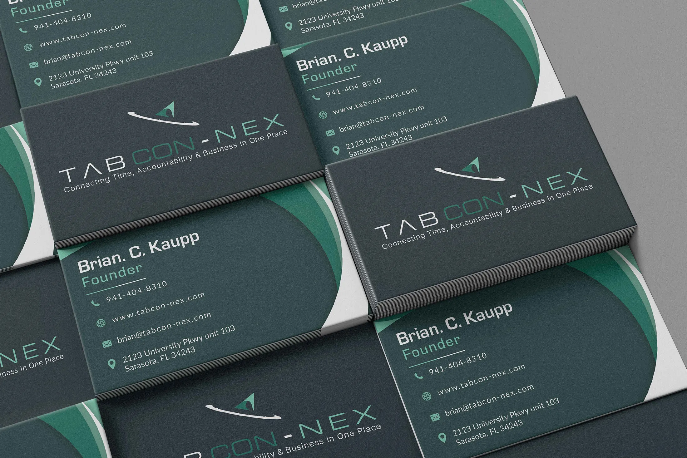
Every element of TABCon-Nex’s brand was designed to communicate efficiency and control from the crisp, modern color palette that reflects accessibility and focus, to the clean layouts and intuitive typography that reinforce clarity, mobility, and ease of use.
Black
#010101
Medium Jungle Green
#202F35
Teal Green
#026E5C
Pale Teal
#75C8AD
White
#FFFFFF
Productivity You Can Track: A Fresh Look for TABCon-Nex
TABCon-Nex came to us with a powerful mobile solution and a clear goal to help small businesses and field teams manage their workforce with greater efficiency and accountability. With features like time tracking, geofencing, and HR compliance, they needed a brand presence that made their value instantly clear.
We created a refreshed identity centered on simplicity and control, delivering a clean, intuitive visual system and a website designed to highlight the app’s features and real-world benefits. The result is a modern, mobile-first brand that positions TABCon-Nex as an essential tool for teams that need to stay connected, compliant, and on track.
A Presence That Reflects the Platform
TABCon‑Nex needed a tradeshow booth that not only draws attention, but also clearly tells what they do at a glance. We designed visual assets that reflect their mobile-first workforce platform: clean signage, bold graphics, and concise messaging that speak directly to field teams and business operators. The result is a tradeshow display that’s professional, approachable, and built to generate leads, moving people from passing interest to meaningful conversations.


![Every wallpaper pattern is a moodboard waiting to happen.
[Branding, Marketing, Content Creation, Social Media Strategy, SEO, Creative Agency, Small Business Growth, Web Design, Digital Marketing, Creative Projects, Design Inspiration, Brand Development, Client Experience, Business Growth]
#DesignInspiration #CreativeProjects #BusinessBranding #SocialStrategy](https://doncreativegroup.com/wp-content/plugins/instagram-feed-pro/img/placeholder.png)